


#2 - How not to reinvent the wheel
An ode to design patterns


A few months ago, a UX bootcamp graduate reached out to me about their portfolio. They had graduated a while earlier but they still weren’t able to find any jobs. So I started reviewing their case studies, and in the first one, a mobile app, I saw something like this:

The menu of the app was placed in a floating section on the bottom right of the screen and the rest of the scrollable content was squished to the left to make up for the lost vertical space. For an experienced designer, this is a red flag 🚩. Why, you might wonder?
1. The navigation shown above goes against mobile navigation best practices and guidelines.
When you start looking critically at interfaces, you will notice how when it comes to the basics, the vast majority employ patterns for flows such as
signing up and logging into an account
buying a product
interacting with content (e.g. likes, comments, etc.)
The experience of the user remains consistent throughout different digital products. This is especially true for navigation.
On mobile devices, when it comes to interacting with the main menu, you would usually see patterns such as bottom navigation and hamburger menus. There is a whole literature online about mobile navigation so I won’t go into detail about this topic, but it’s important to note that each pattern has been heavily documented with guidelines, best practices, as well as plenty of examples which include do’s and don’ts.

Inventing a new pattern means that you would need to figure out every little aspect of this new kind of interaction by yourself with (at minimum) tons of testing and iterations. In the case of the design presented by the mentee, they would have for example to find a solution for the loss of space caused by the way the menu was placed.
2. Users hate change
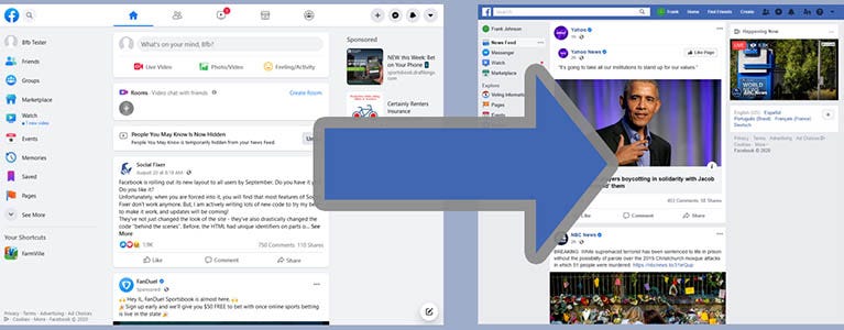
When I was a teenager, Facebook was the prominent social media for people my age and over. Whenever Meta would release a new update that would heavily impact the UI or a heavily used functionality, the users would revolt on the platform.
Jakob’s Law explains this concept quite well:
Users spend most of their time on other sites. This means that users prefer your site to work the same way as all the other sites they already know.
When a user gets accustomed to interfaces, they will expect to have a similar experience on other ones. This is because they have acquired specific mental models, and discarding them causes frustration as they need to learn a whole new system yet again.
So next time you are faced with the design of an application, take some time to study and learn the relevant design patterns. This will help you work faster as well as avoid unnecessary negative feedback during usability sessions (and portfolio reviews).
Book recommendation: Fixing Bad UX Designs by Lisandra Maioli
In universities and bootcamps, students are very often presented with imaginary scenarios, where a new digital product must be designed from scratch. But what happens when instead, the designer is faced with a bad UX to fix?
I picked up this book myself about a couple of years ago - I had started working on a very complex B2B interface as a solo designer and let me tell you, a lot needed to be done! As often happens in environments that are not designer-centric, I was called to work on the interface long after some key features had been released, and I was unsure how to tackle some major UX issues I was seeing.
This book helped so much! It provides you with a useful outline of the steps to take, activities you can perform during the project as well as practical examples and tools.
Is there any topic you would like me to cover in the future? Leave a comment below!